Thursday, 5 December 2013
Friday, 15 November 2013
Thursday, 14 November 2013
Pages 2-5, again inked digitally in Manga studio. Still getting used to the software, but it definitely makes a few things easier by being able to use layers, unlike inking traditionally. Some details are easier to do by hand though. I'll need to find what balance of the two works for me. I still need to work on my backgrounds though, they aren't as strong as my characters.
Thursday, 7 November 2013
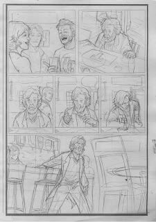
Pencils for pages 1-5. Some of these got looser and rougher once I decided I was going to ink digitally after using Manga Studio, as some of the harder shots or details can be played around with more when inking that way as opposed to traditionally. For example, the bar fight in page 4 was a tricky page to organise, and I forgot to go back to the rough before pencilling and had to part of the image to where it should really be.
Thursday, 24 October 2013
The blue-line roughs for pages 1-5. Going to blow them up and do some more defined roughs soon. One of my earlier sketches captured the bartender's anger while kicking the patrons out perfectly (in my mind) - so he's just been dragged and dropped into the rough. One of the advantages of working semi-digitally!
Monday, 14 October 2013
Since this is going to be set in the 80s, I figured it would be good to make it look like and 80s comic - limited colour palette and all. As I'm still getting used to colouring, my style is fairly simple in that regard, usually consisting of just flats and a few shadows and hi-lights when need with a filter to mimic the CMYK dots printers use. The 80s look isn't much of a stretch in that regard, and while it would be nice to have a really painterly, Dean White style set of colours I don't want to experiment and fail at this stage. I'd prefer to do something I know I can, and do it well. The limited palette will likely be enough of a struggle anyway, as I don't have much of an eye for colour. However, one of the palettes I found is split into warm and cool colours, which should be useful. I still want to colour-drop the Djinn, though, as that'll make him look even weirder in this setting. These are the first couple of tests - some flats on 'Al' using the palettes I sourced online, plus playing around with a semi-transparent layer of old paper, and the original digital inks.
Thursday, 10 October 2013
Here are the digital panel layouts for the 5 pages. I want them to mirror each other after the mid-point - the Djinn ending up right where he started by the end. Usually do these by hand, but seemed faster to do in Photoshop (though still getting the hang of some of the digital tools, took far too long trying to get the square tool to only leave an outline). Making sure they were perfect mirrors of each other was easy too. Some resolutions seem to drop some of the lines, but hopefully printing them will work out fine. If not, back to basics. This is how I want it though - not too complicated or cluttered, nothing fancy, but works well with the story I'm trying to tell. Rough sketches and colour-script soon. (First two digital pages seem to go grey when uploaded here - not sure why, they're the same files as the last 2 just rotated... Hopefully print fine).
The Djinn was harder to design - he/it needs to be expressive for the final page, but I don't want them to be too human. They're supposedly 'born of fire without smoke' so its true form being something to do with green flame appealed to me. In 'Al's eye he's just a green flame, but I figure when he's free to roam his build is more human-like - so I went with the ideas of his looking like an invisible man. That's on fire. And green. That's weird enough, right? Thinking of colour-dropping him too - having the only supernatural character be made up of just colour in a mostly line-based piece makes sense. What to do specifically with the bottom half is a weird one, as most pop culture versions of genies have their bottom half connected to their lamp - which he doesn't have. I like the ideas of lighter flames coming out of his eyes and mouth, and maybe some kind of form being visible underneath. But, while useful ref, I don't want him to be too Ghost Rider or Human Torch. Johann Kraus from 'Hellboy II: The Golden Army' (when not in his suit) could be good to look at. Google seems to be rather light on pictures of that, but luckily the DVD's on my shelf at home. The 'Burning Man' stunt should be helpful to look at. A bit more development work needs done with this guy though.
REF:
Subscribe to:
Comments (Atom)


.jpg)
.jpg)
.jpg)
.jpg)

.jpg)
.jpg)
.jpg)
.jpg)
.jpg)


1.jpg)


.jpg)
.jpg)
3.jpg)
2.jpg)


